Non-White Wedding Dresses: The Colors Dominating 2026
The alternative colors to white dominating bridal fashion in 2026: lavender, champagne, blush, sky blue and green. How to choose yours without regrets.
Created with AI assistance and human review. Editorial standards
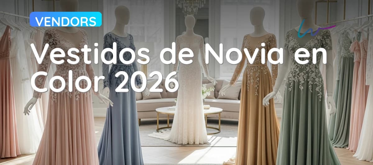
Non-White Wedding Dresses: The Colors Dominating 2026
Something has shifted on the bridal runways of Milan, New York and Madrid over the past four seasons. White no longer opens the shows with the same authority it once commanded. In its place, the 2025-2026 collections are sending lavender, champagne, blush, sky blue and even green down the aisle with the same conviction that ivory once held. This is not a fleeting Instagram trend: it represents a genuine movement in how the industry — and brides — think about the wedding dress.
If you are already exploring the key wedding dress trends for 2026, you will have noticed that color is one of the most persistent currents of the season. This guide goes one step further: it examines each tone, explains which skin tones it flatters, how it ages in photography and how to make sure the groom does not clash.
Why White Is No Longer Compulsory in 2026
The white wedding dress has a shorter history than most people assume. Before the nineteenth century, brides wore their finest dress regardless of color. Queen Victoria's 1840 wedding popularized white in the English-speaking world, but it took decades to become a global standard. In Spain, white bridal wear only cemented itself as a mass convention in the 1960s and 1970s with the rise of ready-to-wear bridal chains.
What is happening in 2026 is not a revolution so much as a return to creative freedom. According to season reports from Vogue Bridal and BRIDES Magazine, the proportion of bridal collections that include at least one non-white tone rose from 34% in 2020 to 71% in 2025. Several forces are driving this:
Digital photography changes how color reads. Modern cameras and editing software reproduce whites with great literal accuracy. Many brides discover in the fitting room that pure white washes out their face or flattens their complexion on camera. Alternative tones — champagne, lavender, blush — add depth without sacrificing the bridal reading of the dress.
Social media broadens the reference pool. Instagram, Pinterest and TikTok expose brides to millions of wedding images from around the world, including cultures where red, gold or blue are traditional bridal colors. That exposure normalizes what once seemed eccentric.
Later marriages and second weddings. The average age at first marriage in Spain now exceeds thirty (INE, 2023). Many brides feel pure white does not represent where they are in life and prefer a tone that better aligns with their adult identity.
Self-expression as a core wedding value. The generation of brides getting married in 2025-2026 has grown up with personalization as the norm in every domain of consumption. The wedding dress is no exception: color is a way of saying something distinctly your own on the day when everyone is looking at you.
Lavender: The Romantic Tone Taking Over Bridal Runways
If there is a single color that defines the 2025-2026 bridal season, it is lavender — not saturated lilac or deep violet, but the grey-tinged, low-saturation violet that designers label "lavender mist" or "parma soft" in their technical sheets.
Why It Works So Well as a Wedding Dress
Lavender shares the same cool color temperature as pure white, which maintains the airy, romantic quality associated with bridal wear. But unlike white, it adds a layer of personality without being disruptive. In outdoor photography with warm afternoon natural light — the conditions preferred by most wedding photographers across Spain and Southern Europe — lavender captures light in a way white simply cannot: it creates soft gradients, warm shadows and a visual presence that stands out without competing with the landscape.
What Type of Wedding It Suits
Lavender works especially well in garden weddings, rural estate venues and spaces with greenery. The contrast between the cool-pink tone of the dress and the natural greens of the setting is photographically very potent. It also holds up beautifully in interiors with abundant natural light — large-windowed salons, white-washed spaces — where the color can develop its full range of nuance.
In dark interiors or spaces with heavy artificial lighting (especially warm yellow light), lavender can lose its subtlety and appear flatter. If your venue fits that profile, it is worth viewing the fabric under that specific light before committing.
The Best Fabrics for Lavender
Organza and chiffon transmit lavender's lightness most effectively, allowing the color to shift with movement and light. Crepe and matte satin give a more architectural, formal reading. Mikado in lavender has a very solid presence that works well in structured silhouettes. Lace in lavender can be beautiful but benefits from being very pale — almost grey — to avoid reading as costume-like.
Champagne, Ivory and Blush: When "Almost White" Is More Sophisticated
Before committing to a recognizable color, there is an intermediate territory that many brides choose: the "almost white" zone. Champagne, ivory and blush maintain the bridal reading of a white dress while adding a warmth that pure white cannot offer. And that has very practical consequences.
The Differences Between Tones
These three terms are frequently used interchangeably in bridal boutiques, but they describe distinct things:
Ivory is white with a very subtle yellow base. It is the quintessential warm white, the tone that works best on medium and olive skin because it adds warmth without yellowing. Most dresses sold as "white" in Spanish ateliers are technically ivory.
Champagne goes a step further toward a golden base. It is darker than ivory, with a clearly peach-gold cast that is especially visible in satin and mikado. In photography, champagne reproduces the warm tones of late-afternoon light in a way that is very flattering. In crepe or chiffon, the effect is more delicate.
Blush is the 2026 fashion pick: a tone sitting between ivory, peach and dusty rose that in fabric reads almost as a lightly flushed white. It is the most versatile of the three — it can read as white in certain lights and as color in others — making it a safe choice for brides who want a hint of color without taking a risk.
Which Skin Tone Each Flatters
On very fair or rosily-toned skin, warm champagne can yellow the complexion; ivory and blush work better. On medium and olive skin — the most common profile in central and southern Spain — all three are flattering, with champagne offering the most drama and blush the most subtlety. On darker skin tones, golden champagne creates a beautiful contrast; ivory can disappear through tonal similarity.
All included
- Banquet venue
- Wedding Planner
- Marriage Paperwork
- Photographer
- Décor
- Flowers
- Master of Ceremonies
- Deejay
- Open Bar
Blue, Sage Green and Gold: For the Bride Who Wants to Be Remembered
If lavender and champagne represent the middle ground between tradition and change, a third group of colors belongs to a different category entirely: those that make an explicit statement. Sky blue, cobalt blue, sage green, lime green and gold do not attempt to resemble white. They are colors that say something clear about who this bride is.
Sky Blue: The Most Wearable Option in the Group
Sky blue — that pale, almost-pastel blue that English tradition associates with "something blue" — is the easiest non-white color to wear as a full wedding dress. It carries historical bridal connotations (in Anglo-Saxon tradition, blue represents fidelity), works indoors and outdoors, and photographs beautifully in cool natural light (spring mornings, north-facing interiors).
Cobalt or royal blue is a bolder proposition that works especially well at evening weddings or in interiors with controlled lighting. In outdoor daytime settings it can read very intensely, which may be precisely the intention.
Green: From Sage to Lime
Sage green — that grey-green, low-saturation tone — has been a trend in interior design and general fashion for the past three years and arrived in bridal wear with real momentum in 2025-2026. It has a botanical sophistication that suits rural weddings, gardens and natural settings particularly well. It is one of the colors that ages best in photography because it is not tied to a specific era: it reads as timeless.
Lime green and emerald green are bolder propositions. Lime feels very contemporary — it risks dating if the trend passes — while emerald has a longer history in haute couture and ages more gracefully. Both require genuine stylistic conviction: these are not colors for the uncertain bride.
Gold: The Most Formal Color in the Group
Gold in a wedding dress is not new — it has deep roots in Mediterranean, Indian and Latin American bridal traditions — but its appearance in Western bridal collections has grown through 2025-2026. Gold works best at evening weddings with warm lighting, where the fabric captures light in a way that daytime cannot replicate. In daytime outdoor settings, gold can read as overly intense for mainstream Spanish bridal taste, but in an evening venue with candlelight or warm ambient light, the effect can be extraordinary.
When the Boldest Colors Work Best
The general principle is straightforward: the most saturated and daring colors work best when the overall style of the wedding supports that choice. A wedding with vivid décor, a couple with a strong personal aesthetic, a small intimate celebration, or a powerful natural setting — a vineyard, a Mediterranean garden, a clifftop venue — are all contexts where green, blue or gold make sense. At a conventional formal wedding with multi-generational guests, the softer tones — lavender, champagne — tend to generate less friction while still departing from white.
Choosing a Color You Will Not Regret in Photos Ten Years From Now
The question almost every bride asks when she considers an alternative color is: "Will this look like a costume when I look at the photos in ten years?" It is a fair question, and it has a real answer.
The Saturation Principle
Saturation is the single most important factor in how a color ages in photography. Low-saturation tones — dusty lavender, blush, pale sky blue, soft sage — are the ones that hold up best over time because their chromatic commitment is subtle: they add warmth or freshness without stridency. High-saturation tones carry more risk because they are more closely tied to the aesthetic of a specific moment.
The Multi-Light Photo Test
Before confirming a colored dress, it is worth photographing yourself in at least three different lighting conditions: direct natural light outdoors, diffused natural light indoors (window light, overcast day) and artificial light (flash or warm room light). The results can be surprising. A lavender that seems subtle in the atelier can appear much more intense in a midday outdoor photo, or a champagne that glows in natural light can wash out under flash. Your photographer will thank you for doing this test before the wedding.
The Jaw-Line Color Test
The most practical trick for evaluating whether a color is flattering: hold the fabric near your neck and look in a mirror at how the color reflects on the skin beneath your jaw and around your eyes. If the color projects greenish-yellow shadows or adds a tired quality to your face, it is not working for your complexion regardless of how beautiful it looks on the hanger. If your skin looks more luminous and rested, the color is earning its place.
The Season Factor
The season of your wedding also matters. Cool tones — lavender, sky blue — suit spring and autumn weddings, when the light is more lateral and soft. Champagne and blush are omnivorous: they work in every season. Green and gold have a natural affinity with late summer and autumn, when the warm light and seasonal palette reinforce rather than clash with the dress.
The Groom: How to Coordinate His Suit With a Colored Dress
The coordination between the bride's dress and the groom's suit is one of the most misunderstood aspects of wedding style. The idea that they must "match" comes from a very specific catalogue aesthetic that does not have to be yours.
Coordinate by Color Temperature, Not Exact Tone
The most useful principle is tonal coherence. If the dress is in a cool tone (lavender, sky blue, aqua green), a suit in pearl grey, navy or charcoal creates harmony without repeating the color. If the dress is in a warm tone (champagne, blush, gold), a suit in sandy beige, warm taupe or warm grey holds the same temperature.
White or ivory on the groom can work with any colored dress as long as it is clearly distinct from the dress tone. If the bride is in champagne and the groom in a very similar cream suit, the tonal difference can look accidental rather than deliberate.
The Shared Accent Rule
An elegant solution is for the groom to incorporate a small element in the same tone as the dress: a pocket square, tie or boutonniere in lavender when the dress is lavender, or sage green when the dress is green. This small detail creates a visual link between the two without the pair looking like a matched set.
When to Avoid Literal Coordination
If the dress is in a bold color — cobalt blue, emerald green, gold — reproducing it literally in any element of the groom's suit can look over-engineered. In those cases, a clean contrast — a black, dark navy or charcoal suit against a colored dress — creates more visual impact and is more timeless in photographs.
Related Reading
This article was reviewed by our editorial team. How we create our content
Frequently Asked Questions
Not sure which one suits you?
Try every silhouette on your own photo with Wedded's virtual try-on. The first 5 try-ons are free.


